Most designs go wrong when buyers pick fonts and symbols before deciding on the companion-specific mark that still feels recognizable. Decide that first, then let it guide the rest.
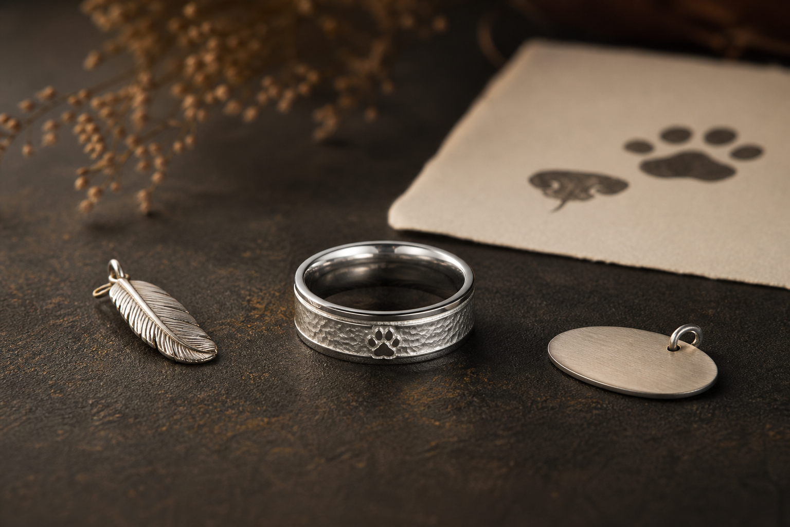
Consider a pet name, paw print, nose print, feather outline, collar tag, favorite toy shape, adoption date, or short nickname. The right choice is whichever one still feels personal after the ring has been worn for a while, not just in the first week.
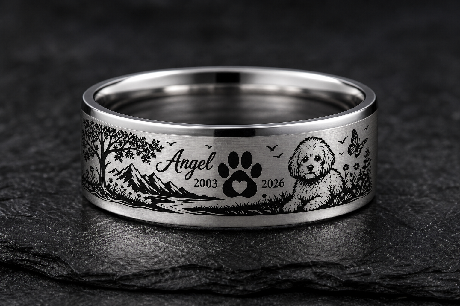
the outside can hold the companion mark, while the inside can carry the name, date, or private phrase. A ring reads better when each side has one clear purpose instead of splitting attention.
soft silver and dark grooves keep small prints readable without making the ring look like a novelty charm. Match the finish to the engraving depth and contrast the design actually needs.
use the name or nickname the family actually said every day instead of generic pet-loss wording. Read it out loud before finalizing; wording that sounds right out loud usually reads right on metal.
collect the clearest pet photo, paw or nose print, tag image, or silhouette reference and identify which feature matters. Blurry or low-contrast files force the design to guess at details that should be intentional.
choose the animal-specific source first, then add one name or date so the ring stays wearable. A ring with one clear center of meaning almost always outperforms one with several.
Watch for avoid using dog-only symbols if the memorial is for a cat, horse, bird, or other companion. These are the details that look fine on screen and disappoint once engraved.
Before going further, decide whether the ring should preserve the pets name, face, print, collar, habit, or favorite place. That answer should guide the phrase, finish, and placement that follow.
The next step is simple: bring the pet name, species, chosen source file, date, and one memory note into the Friends of Irony designer.