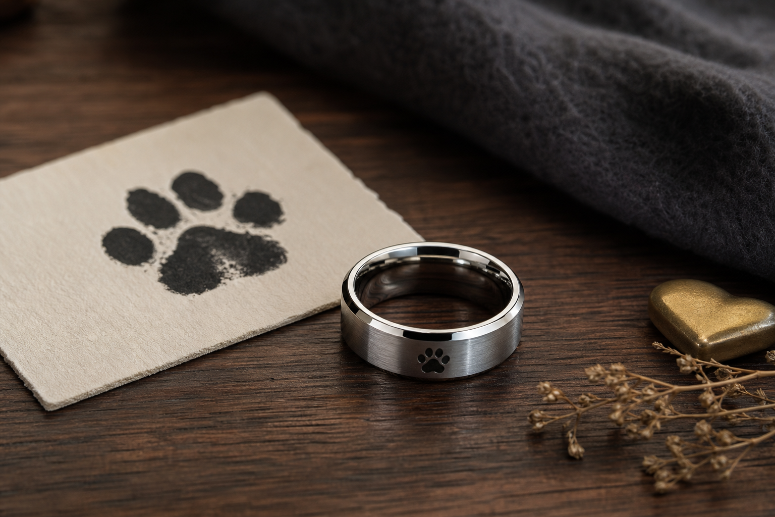
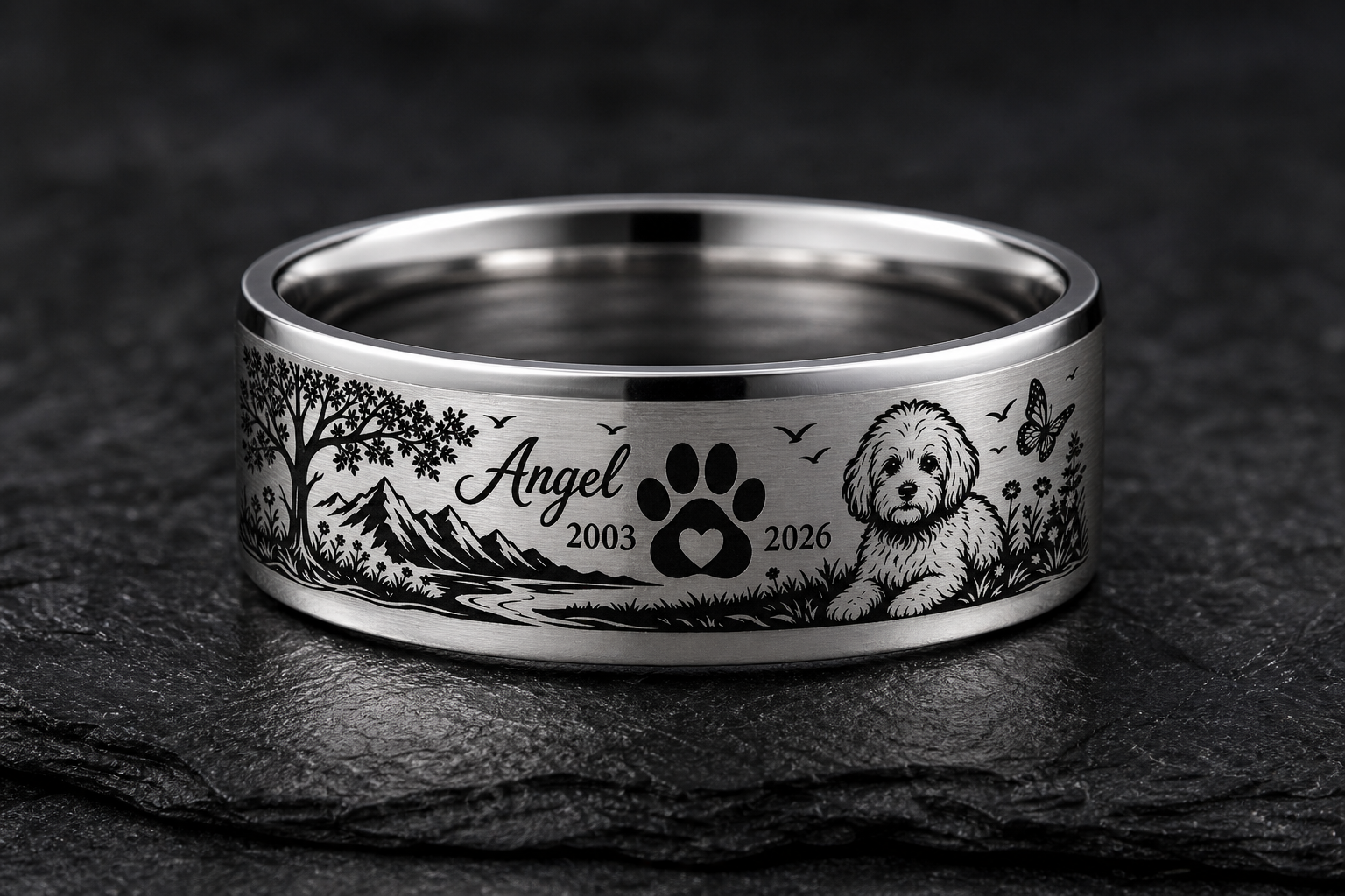
Start with the paw shape that still feels like the dogs presence. A ring built around one clear anchor wears better over time than one built around several competing ideas.
Consider a single paw print, dog name, years together, "Good Boy," "Run Free," or a small trail memory. The right choice is whichever one still feels personal after the ring has been worn for a while, not just in the first week.
a paw print can sit outside as the main mark, while a name or date can stay inside. A ring reads better when each side has one clear purpose instead of splitting attention.
silver and darkened grooves help the paw shape read clearly at ring size. Test the finish against daily wear and work routines before locking it in.
use the dogs real nickname if it carries more feeling than a polished phrase. Say it exactly the way it should be read, then trim anything that is not doing real work.
send the cleanest paw print from ink, clay, a vet card, or a sharp photo. The clearer the source, the less the final engraving has to be simplified or guessed.
one paw plus one name is usually stronger than several pet icons. Everything on the band should point back to the same idea.
Avoid using a muddy paw print if another source has clearer pad edges are the usual problems here. When in doubt, remove a detail rather than add one.
Decide this first: decide whether the paw should look subtle or instantly visible. It is easier to add detail later than to remove it after the ring is ordered.
The next step is simple: bring the paw image, dog name, date, and one short memory note into the Friends of Irony designer.